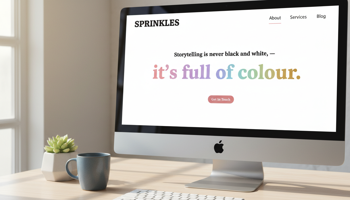
SPRINKLES
Brand Guidelines

A comprehensive guide to the Sprinkles PR brand identity—how we look, speak, and show up in the world.

Version 1.0 April 2026 Confidential
01 — Brand Story
Storytelling is never
black and white.
It's full of colour.

Our Origin

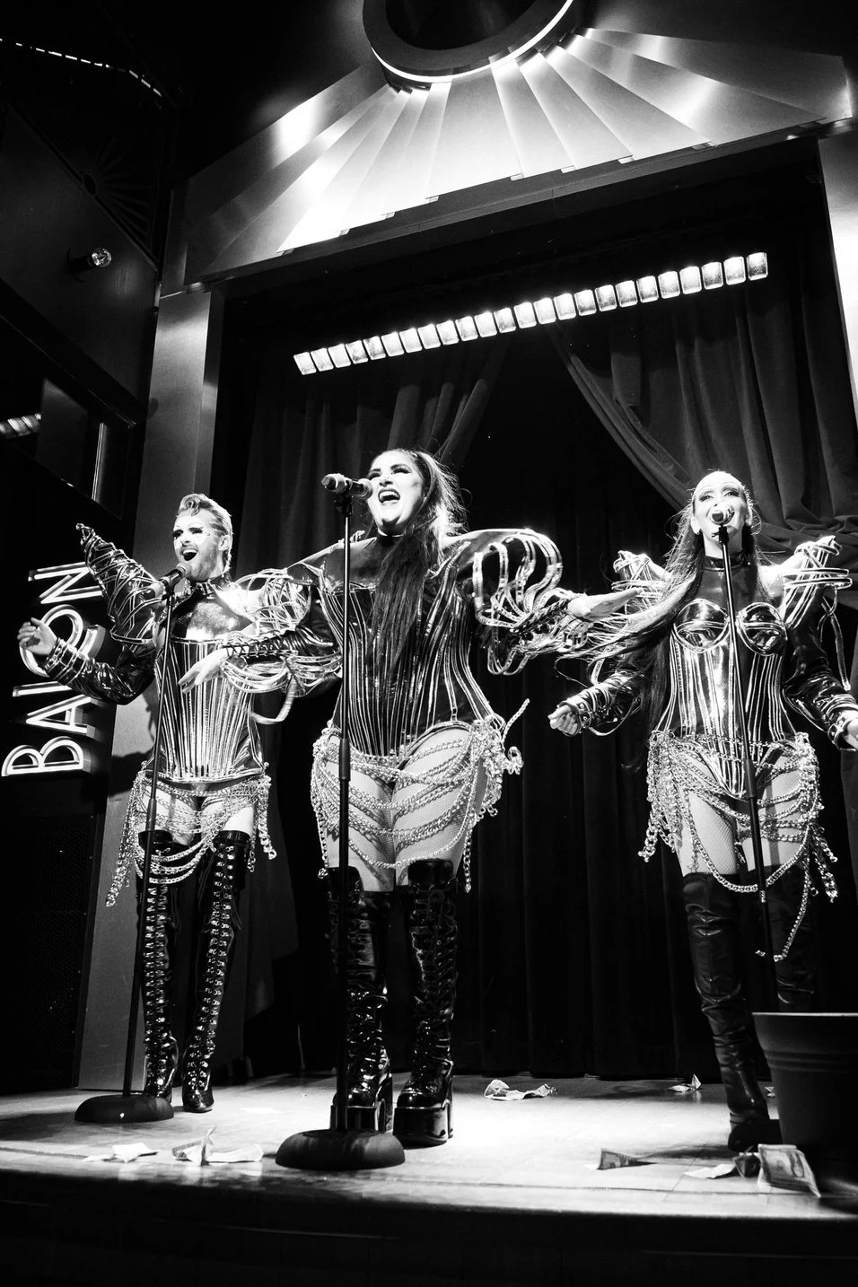
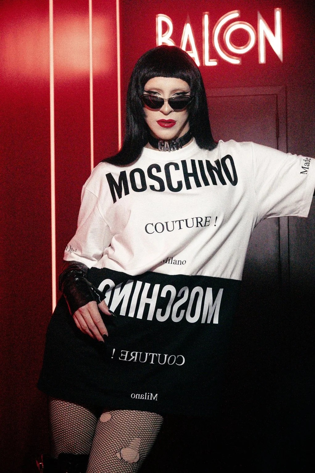
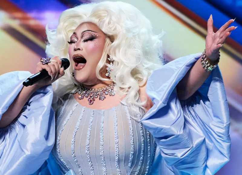
Sprinkles began at the crossroads of queer culture, nightlife, and community—launching with Apocalypse Noir at Balcon Salon and quickly earning coverage in Billboard, The New York Times, and Time Out.

What started as a PR firm for queer talent, venues, and organizations has grown into something bigger. Today, Sprinkles works across arts & culture, mission-driven leadership, and tech & innovation—bringing the same story-first, culturally fluent approach to every client we take on.

Our Mission

Amplify silenced voices. Spotlight missions. Bring what's in the shadows to light.

We believe every story deserves to be heard in the right rooms, at the right time, by the right people. We don't just pitch press—we build narrative infrastructure that earns trust, credibility, and coverage.

Kerri Colby

Brand Positioning

Sprinkles is a New York-based PR and media company that earns attention for talent, venues, and mission-driven brands across press, digital, and social. We're not a traditional PR firm—and that's the point.

We bring cultural fluency, direct media relationships, and a story-first approach to an industry that too often communicates in jargon. If you want press that actually connects with people, we know how to do that.

Brand Personality

Approachable Compassionate Witty Determined Bright Ambitious Layered Culturally Fluent

Brand Pillars

01
Spotlight

Position clients as culturally relevant through compelling storytelling.

02
Amplify

Build unified presence across earned, digital, and social.

03
Convert

Turn awareness into measurable results.

02 — Why We Exist
The stories that matter most are often
the hardest to hear.
01

Media censorship and landscape shifts mean important voices—queer culture, mission-driven organizations, emerging tech—are increasingly sidelined from mainstream coverage.

02

Traditional PR speaks in jargon and trades in gatekeeping. The brands and people doing the most interesting work can't always access the firms that could amplify them.

03

Sprinkles exists to close that gap. We bring direct access to mainstream media and a culturally fluent approach that meets clients wherever they are—and gets them heard.

03 — Who We Are
Built at the crossroads of culture, community, and media.

Sprinkles PR is the culmination of Revaz Grigolidze's years working at the intersection of nightlife, entertainment, advocacy, and tech. He's built relationships across every one of those worlds—and knows how to move fluidly between all of them.

That range is what makes Sprinkles different. Whether it's a drag performer earning a New York Times feature, a nonprofit landing GLAAD coverage, or a tech startup breaking through in Axios—we bring the same directness, warmth, and strategic precision to every story.

"Queer culture is not just part of the household. It's part of the corporate blueprint. It's success, love, real."
Revaz Grigolidze at a Sprinkles PR event
04 — Values
What we
stand for.
01

Love

We lead with genuine care for the people and missions we represent. Every pitch, every placement, every strategy is rooted in respect for the story we're helping tell.

02

Integrity

We don't oversell. We don't overpromise. We build trust through honest strategy, transparent communication, and work that speaks for itself.

03

Respect

Every client's story matters. We approach each engagement with cultural sensitivity, active listening, and a commitment to amplifying—not overwriting—the voice of the people we serve.

04

Ambition

We think bigger than the brief. Our goal isn't just coverage—it's building the kind of media presence that changes how a client is perceived, permanently.

05

Range

From nightlife stages to tech boardrooms, nonprofit galas to digital campaigns—we move between worlds with the same confidence and cultural fluency.

06

Colour

We reject the idea that storytelling is one-dimensional. Every brand has layers, and we bring every one of them to the surface—vivid, bold, and full spectrum.

06 — Color Palette
Full of colour.

The Sprinkles palette is soft, warm, and intentionally pastel. Six gentle tones—drawn from the brand's own rainbow gradient—represent the diversity, warmth, and range of the stories we tell. The softness is the point: approachable, never aggressive, always inviting.

The Spectrum

Rose
#F4A5AB
Blush
#E8B4CB
Lavender
#C4A8DE
Sky
#A5C8F0
Mint
#A0DBC5
Honey
#F5D196

Primary Color

Rose is the lead accent in brand communications—buttons, CTAs, highlights, and key accent marks. For moments requiring more contrast (small text, UI elements), the saturated variant provides a slightly deeper tone while staying within the pastel family.

Rose (Primary)
#F4A5AB · RGB 244, 165, 171
Rose Saturated (CTA / UI)
#D4737B · Use for buttons, links, interactive elements
Rose Tint
#FDF0F1 · Use for backgrounds, hover states, pill accents

Neutrals

Black
#0D0D0D
Charcoal
#3D3D3D
Grey
#808080
Snow
#FAFAFA

Usage Ratio

The pastel spectrum is generous—it can be used more freely than a saturated palette. Neutrals still anchor the design, but pastels can fill larger areas (cards, section tints, backgrounds) without overwhelming. The gradient works as rules, borders, and soft washes.

40%
30%
10%
20%
Black / Dark — 40% White / Snow — 30% Rose Primary — 10% Pastel Spectrum — 20%

The Spectrum Gradient

The gradient is Sprinkles' most distinctive visual element. It flows through all six spectrum colors and symbolizes the brand's core belief: storytelling is full of colour.

linear-gradient(90deg, #F4A5AB, #E8B4CB, #C4A8DE, #A5C8F0, #A0DBC5, #F5D196)
135deg diagonal variant — for larger surfaces and hero backgrounds

Accessibility

AAA Black on White — 19.4:1
AA Rose Sat. on White — 4.5:1 (large text OK)
AAA Charcoal on White — 10.3:1

Spectrum colors should not be used for body text on light backgrounds. Use black or charcoal for readable text. Spectrum colors are for accents, icons, and decorative elements.

07 — Typography
Type that's bold
and full of range.

Display — Outfit

Outfit is a geometric sans-serif with personality. It's modern, confident, and slightly rounded—matching Sprinkles' approachable-yet-professional energy. Used for all headlines, section titles, and large-format text.

Aa
ABCDEFGHIJKLMNOPQRSTUVWXYZ
abcdefghijklmnopqrstuvwxyz 0123456789
300 Light Full of colour
400 Regular Full of colour
600 Semi Full of colour
700 Bold Full of colour
800 Extra Full of colour
900 Black Full of colour

Body — DM Sans

DM Sans is clean, geometric, and highly readable across sizes. It pairs naturally with Outfit while maintaining its own quiet confidence. Used for body copy, UI text, and all long-form content.

We help talent, venues, and mission-driven brands earn the attention they deserve across press, digital, and social.

Mono — DM Mono

DM Mono is used for section labels, metadata, technical specifications, and small functional text. It adds structure and editorial precision.

01 — BRAND STORY · VERSION 1.0 · #E84855

Type Scale

H1 — 72px / 800 Brand Guidelines
H2 — 48px / 300 Full of colour
H3 — 13px / 600 / UPPERCASE Section Heading
Body — 16px / 400 We position clients as culturally relevant through compelling storytelling.
Caption — 11px / Mono 01 — Brand Story
08 — Photography
Real stories.
Real people.

Sprinkles photography captures the energy, culture, and community of the people and brands we represent. Every image should feel authentic, alive, and intentional—never staged, sterile, or stock.

Apocalypse Noir performing at Balcon Salon
Nightlife candid at a Sprinkles client event
Performer portrait at Balcon
NYC venue patio with rainbow wall
Performer singing live on stage

Do

Use candid, editorial-quality photography that feels alive and in-the-moment.

Feature real clients, real events, and real coverage moments whenever possible.

Embrace bold color, dynamic compositions, and environmental context.

Include diverse representation across race, gender, age, and body type.

Don't

Use generic stock photography (corporate handshakes, fake smiles, posed groups).

Use photos of people the brand has never worked with or been associated with.

Use product-style photography unrelated to PR/media/events.

Desaturate or heavily filter images—let natural color come through.

Technical Specs

Resolution

Minimum 300dpi for print, 72dpi for web. Source files should be minimum 3000px on the longest edge.

Color Profile

sRGB for web and social. CMYK (Coated GRACoL 2006) for print. Maintain warm, natural tones.

Treatment

Minimal post-processing. Light contrast and warmth adjustments are fine. No heavy filters, duotones, or overlays.

09 — Voice & Tone
How we
sound.

Sprinkles' voice is consistent across every touchpoint. We're direct without being cold, playful without being unserious, and warm without being soft. The tone flexes depending on context, but the voice stays the same.

Formality

FormalCasual

Conversational and direct. Never stuffy or corporate, but always credible.

Energy

RationalEmotional

Story-led with heart. We inspire through narrative, not data dumps.

Weight

SubtleBold

Confident and punchy. We make statements, not suggestions.

Innovation

TraditionalInnovative

Forward-thinking but grounded. We respect the craft while pushing the conversation.

Word Pairs

We Say We Don't Say Why
Earn attention Go viral We build sustainable media presence, not chasing trends.
Amplify Boost / Leverage Amplify has intentionality. Leverage sounds transactional.
Story-first Content-driven Stories connect. Content is just stuff.
Culturally fluent Diverse / Inclusive Fluency implies depth of understanding, not just a checkbox.
Make some noise Disrupt We're energetic, not destructive.
Full of colour Outside the box Our language should be as distinctive as our brand.
Range 360 / Full-service Range communicates versatility with personality.

In Context

Website Hero

Sprinkles is a New York-based PR and media company helping talent, venues, and mission-driven brands earn the attention they deserve across press, digital, and social.

Email Sign-off

Let us help you make some noise.
Sprinkles has the range to meet you wherever you are.

Social Caption

Another one for the press wall. Congrats to @client on their @nytimes feature — this is what happens when the story is real and the strategy is right.

Pitch Email Opening

Hi [Name] — I'm reaching out from Sprinkles on behalf of [Client]. [One sentence on what makes this story timely, relevant, and undeniable.] Would love to share more.

10 — Layout & Grid
Structure with
breathing room.

Sprinkles layouts prioritize clarity and scannability. Generous white space lets the content—and the spectrum accents—do the work. Dense, cluttered layouts contradict the brand's personality.

12-Column Grid

1
2
3
4
5
6
7
8
9
10
11
12

Max content width: 1320px. Column gutter: 24px. Outer margins scale from 24px (mobile) to 120px (desktop).

Spacing Scale

4px
Micro
8px
Small
16px
Base
24px
Medium
40px
Large
64px
XL
120px
Section

Border Radius

4px — Subtle
8px — Default
12px — Cards
100px — Pills

The Spectrum Rule

The horizontal gradient rule is Sprinkles' signature layout element. It replaces traditional dividers and section breaks with the brand's full-spectrum identity.

Thin (2px) — Subtle dividers, nav underlines
Default (3px) — Section breaks, card accents
Thick (5px) — Hero elements, large-format emphasis
Short (64px) — Inline accents, list markers
11 — Applications
The brand
in the wild.

These mockups illustrate how the Sprinkles identity system comes together across key touchpoints. Each application should feel cohesive while allowing the content and context to drive the layout.

Sprinkles PR business card mockup
Sprinkles PR email signature mockup
Sprinkles PR press release header mockup
Sprinkles PR social media post mockup
Sprinkles PR pitch deck cover mockup
Sprinkles PR website redesign mockup

Service Tier Badges

The tier naming convention—Pastel, Vivid, Bold, Full Spectrum—maps directly to the brand's colour philosophy. Each tier has a visual identity within the system.

Pastel — Entry Level Vivid — Mid Tier Bold — Full Service Full Spectrum — All Access
12 — Don'ts
Protecting
the brand.

Consistency builds recognition. These guidelines protect the Sprinkles identity from dilution, misuse, and off-brand representation.

Visual Don'ts

No stock photography

Never use generic stock images (corporate handshakes, posed smiles, unrelated product shots). Every image should have a direct connection to our work or clients.

No off-brand imagery

Never use photos of celebrities, influencers, or public figures we haven't worked with. If they're not our client, they're not in our materials.

No harsh or neon colors

Don't substitute pastels with saturated neon or primary colors. The softness is intentional—Sprinkles should feel warm and inviting, never loud or aggressive.

No cluttered layouts

White space is a feature, not wasted space. Don't overcrowd sections with text, images, or elements. Brevity and scannability are brand principles.

No gradient backgrounds

The spectrum gradient is an accent element—rules, borders, text highlights. Never use it as a large background fill. It should pop, not overwhelm.

No greyed-out tones

Pastel doesn't mean washed out. The spectrum should feel soft and warm, not flat or desaturated. If it looks grey, it's lost the Sprinkles energy.

Typography Don'ts

Don't use fonts outside the system (Outfit, DM Sans, DM Mono). No script fonts, no decorative typefaces, no system defaults.

Don't set body text in Outfit. It's a display font—use DM Sans for anything longer than a headline.

Don't use spectrum colors for body text on light backgrounds. Use Black (#0D0D0D) or Charcoal (#3D3D3D) for readability.

Voice Don'ts

Don't use corporate jargon: "synergy," "leverage," "360 solution," "disrupt." We sound like real people talking to real people.

Don't make the brand about a single industry. We are not "a queer PR firm"—we're a PR firm with cultural fluency that spans industries.

Don't write long, heavy paragraphs. Keep copy concise, scannable, and direct. If it takes 3 scrolls to reach the CTA, it's too much.

SPRINKLES

Storytelling is never black and white.
It's full of colour.

revaz@sprinklespr.com New York, NY
BRAND GUIDELINES V1.0 · APRIL 2026 · PREPARED BY THE GAYGENCY · CONFIDENTIAL